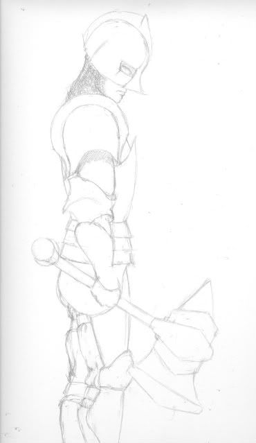
- Title: Exhaused Knight
- Artist: Zoe Cakes
- Description: This is a quick sketch. Looking at it now it really needs to be darkened. How are my proportions?
- Date: 05/15/2009
- Tags: exhaused knight
- Report Post
Comments (7 Comments)
- Hoshi_266 - 07/19/2009
- The proportions are good. I like how you can still get a sense of his facial expression even with the helmet. The shading for the head is good too. And the details to the clothing on the legs are good. If you decide to color it, I recomend not using bright colors, since they would distract from the details you've put in.
- Report As Spam
- sleepy_k25 - 07/14/2009
- its gud
- Report As Spam
- Banana Song Girl 0331 - 07/10/2009
- awesomeness
- Report As Spam
- Captain Shippo - 07/08/2009
- not a comic but cool
- Report As Spam
- Lilith Celestine17 - 07/02/2009
- The sketch was very well done.
- Report As Spam
- Edward Ray - 06/17/2009
- Nice doodle =D
- Report As Spam
- melisstar - 06/11/2009
- very plain
- Report As Spam


