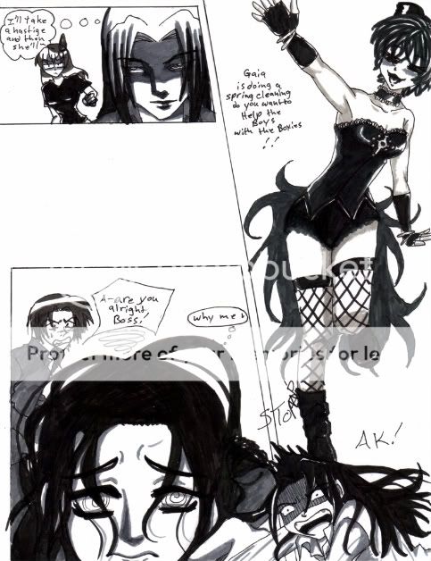
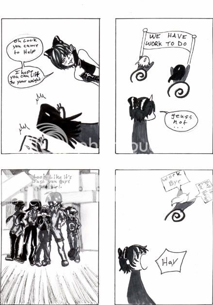
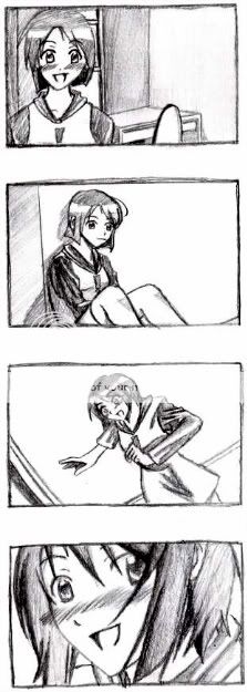
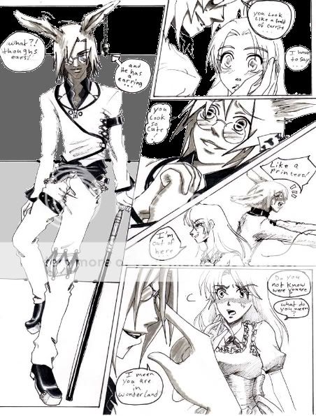
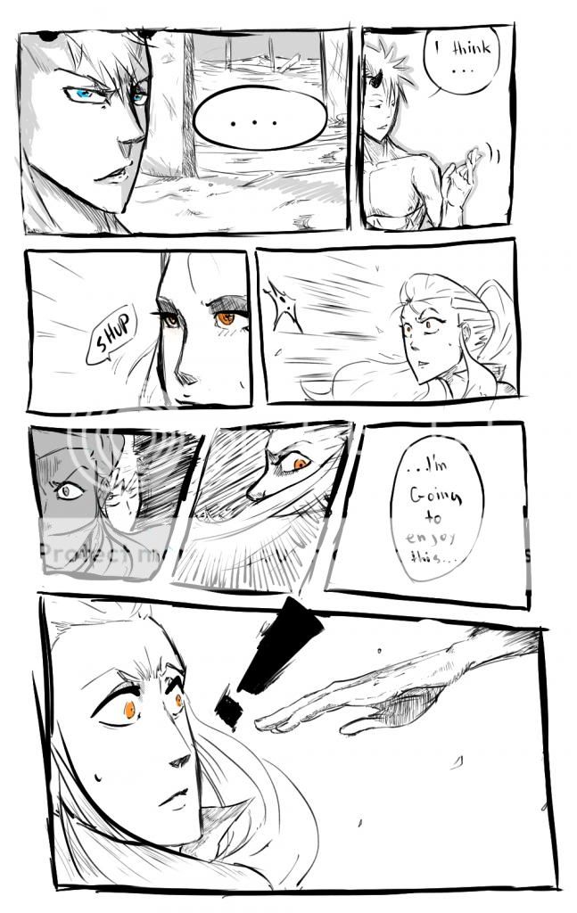
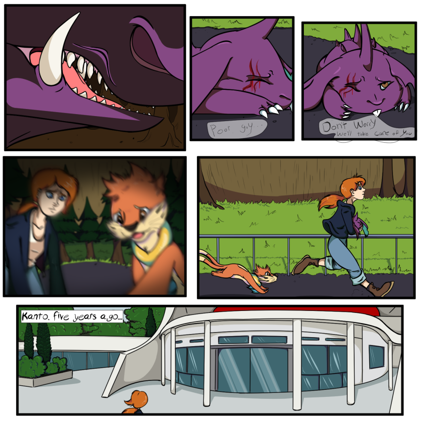
- Title: Zombie Manga (First Page)
- Artist: Slivar
-
Description:
This is my first attempt of the first page of my manga series. I have draw out the entire series on paper, but now that I have a tablet, I decided to try and ink it. Used Manga Studio 4 (Hard to figure out) and a Bamboo Fun Tablet by Wamco.
(18+ to view)
[Stupid Gaia Made Me Resize It Too Small] - Date: 01/11/2009
- Tags: zombie manga first page
- Report Post
Comments (7 Comments)
- iRhei - 03/04/2009
- ok...its more of stupid not creepy theory if i do say so myself..i mean come on.. im just trying to help ^^
- Report As Spam
- UrielxL - 03/02/2009
- Why does it look so off?
- Report As Spam
- Kimberley111 - 02/13/2009
-
.... i agree with the : '' its not creepy but stupid '' theory
o-o'' - Report As Spam
- Tahrgat - 02/09/2009
- I am writing to you from an artists perspective. So when I say things they are meant constructively. A persons eyes are located at the middle of there head. Your zombies head is off in proportion. You should attach the it's head to a body. The ear is massively out of place. The very top of the ear should line up with the eyebrow. The background would look a lot better if you saved the zombie and bullet as a .png file with no background and set a blurred b&w photo of a relating scene in its place
- Report As Spam
- Pathetic Attempts - 02/05/2009
- honestly, its not creepy.kinda stupid, but not creepy.
- Report As Spam
- Ran18 - 02/04/2009
- yUCCKYYYYYYY!!!!!!!!!
- Report As Spam
- Ryananna - 01/27/2009
- O.o...? what u want me to comment xD
- Report As Spam


