- by Eliza Letrange |
- Comics
- | Submitted on 01/16/2009 |
- Skip
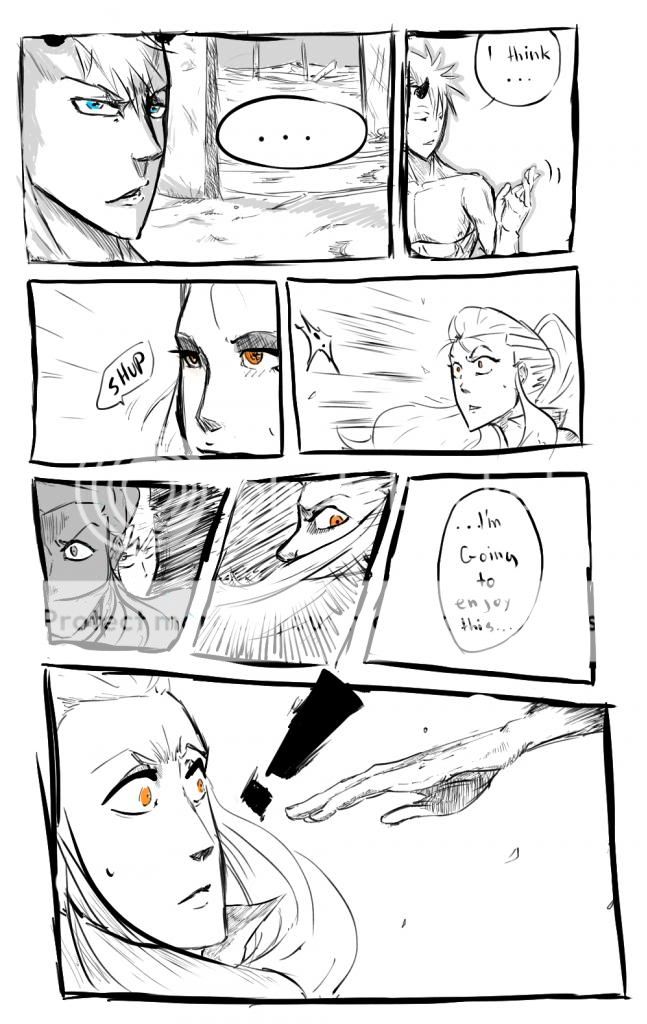
- Title: The Bend-40
- Artist: Eliza Letrange
-
Description:
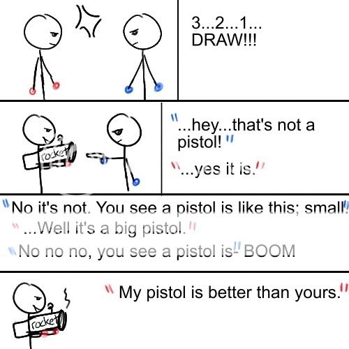
Page 40 of The Bend.
If you would like to see more at a more readable size, please visit http://www.drunkduck.com/The_Bend/
Please read the rest of them to understand the context of this one.
Reads left to right. - Date: 01/16/2009
- Tags: bend40
- Report Post
Comments (6 Comments)
- Mya969 - 02/04/2009
- I like your style, from drawing to layout and even the white spaces ^-^
- Report As Spam
- fujiro_usagi_ji - 01/18/2009
- Woah! Way too many smart people comments here! Let me lighten up the mood with my stupidity. Kahaha! tis too funneh! LOL! OMG! ROFFLE!!! 4/5 To the people who criticize the layout of Eliza Letrage's art, get some perspective and try something new, people!
- Report As Spam
- fall of leaves - 01/16/2009
-
I really like how you draw side views.
Do you always leave a lot of white space on the sides, though? If that was an intentional thing for effect that's dandy, but if that's (still, if this is old?) common, that can be distracting. - Report As Spam
- Eliza Letrange - 01/16/2009
- ... granted, this is quite old. My newer work looks more professional.
- Report As Spam
- Eliza Letrange - 01/16/2009
- A simple matter of aesthetics. I prefer it this way.
- Report As Spam
- Parfait au Lait - 01/16/2009
- Just curious: is there a reason you've chosen to lay out your pages this way? The lack of gutters between panels, coupled with all of the negative space and uneven margins creates a very haphazard page composition. I think a similar panel setup that you have here would be more successful if you made your layout decisions seem a little more deliberate.
- Report As Spam


