- by -MurdererzIntent01- |
- Painting And Drawing
- | Submitted on 08/23/2009 |
- Skip
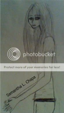
- Title: pikaluv avi art request
- Artist: -MurdererzIntent01-
-
Description:
i also forgot to post this one a looong time ago. she probably forgot by now. i hope not tho.
- Date: 08/23/2009
- Tags: pikaluv request
- Report Post
Comments (7 Comments)
- Epileptic Juicebox - 04/19/2010
-
I LOVE it! It kinda reminds me of when I used to draw like that! 5//5
Rate back? And comment? Please on my entry Amaranthine Inamorata? - Report As Spam
- xXx Sango8 xXx - 09/21/2009
-
Very good!
Would look great with color! - Report As Spam
- -MurdererzIntent01- - 08/26/2009
-
lol. nice.
i h ad probs with the signature(can u believe it?) because my only black pen was running out of ink. out of stress i just sped up the writing. that;s why it came out so big XD - Report As Spam
- haleys dark side - 08/25/2009
- this is amazing how did you learn to draw like that
- Report As Spam
- Pakaless - 08/25/2009
- And for the love of god, why did you make the signature bigger than the pictuire?.. It kind of kills the whole pic. 4 stars
- Report As Spam
- Pakaless - 08/25/2009
-
Well, I disagree with Jessica, pencil has a better look than ink, because: 1. you need to be an expert in caligraphy to produce a beautiful and soft line with ink. 2. Ink toning is harder and has to be done on a bigger format than pencil toning. 3. Pencil gives the sketchy look to the picture. The more sketchy the picture, the more life it has.
And now for the pic. There are some anatomy mistakes, and the contrast is quite off (contrast = image less flat). - Report As Spam
- SphinkterMalfunction - 08/25/2009
- I give it a three. If your going to post something online at least ink it. Or for godsakes go over it with a regular pen. Led is so boring. It's good though. Just not great.
- Report As Spam


