- by The Laurasaur |
- Painting And Drawing
- | Submitted on 10/19/2008 |
- Skip
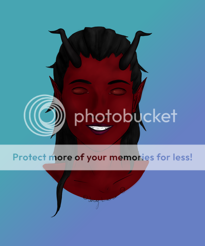
- Title: I am NOT my medication
- Artist: The Laurasaur
-
Description:
My thoughts on myself.
I am not my medication, I am human.
You can find this on my DA page.
No stealing. - Date: 10/19/2008
- Tags: medication
- Report Post
Comments (7 Comments)
- cookie_pirate_sora506 - 10/19/2008
-
Way.
Too.
Bright. - Report As Spam
- The Laurasaur - 10/19/2008
-
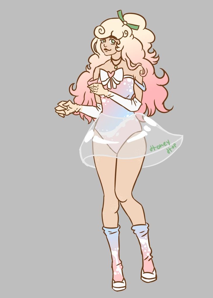
The background is supposed to be chaotic, the lines on her face show shes human and makes mistakes, gets older and hurts, human nature in essence. The ammount of ink on the neck is shading from her hair. The sloppiness was also intentional, more for human mistakes.
But thank you for your critique on the shoulders, they are rather square. <3 - Report As Spam
- xXMartyXxo - 10/19/2008
- Its very wierd but good ^^
- Report As Spam
- Rock Angel 94 - 10/19/2008
- it looks sloppy.like you aren't focusing on one subject. it's like your backround is taken attencion away from the actual girl.watch the amount of ink you put on the neck, it makes a huge statement on your charecter and if there are too many lines-your charecter will seem older than it actualy is.i personally think the shoulders are squared off to much.that it just sortof appears there-and it doesn't look like its connected to the neck-try to angle the part where the neck and shoulders connect.
- Report As Spam
- tani-bananani - 10/19/2008
- scary :S
- Report As Spam
- iRawrr_H3llOxKitty - 10/19/2008
- haha sureprisngly i love this. very bright and colorful (: 5outof5 biggrin
- Report As Spam
- The Celestial Guardian - 10/19/2008
- Well that sure is colorful.
- Report As Spam


