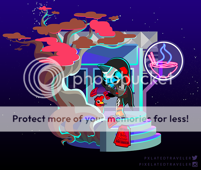
- by xXShugotenshiNoHitokageXx |
- Painting And Drawing
- | Submitted on 12/03/2008 |
- Skip
- Title: Creativity
- Artist: xXShugotenshiNoHitokageXx
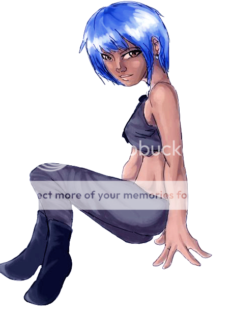
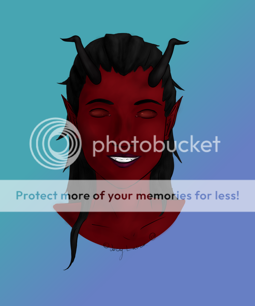
- Description: I really enjoyed making this. I learned a lot of different tricks using photoshop working on this. I feel I have come a long way from my first picture. ( located in my gallery, "L") I still don't like the face area though. Something is wrong with it but I can't see it. Point it out for me oh and leave lots of comments!! >.<
- Date: 12/03/2008
- Tags: flow
- Report Post
Comments (7 Comments)
- natasha924 - 12/05/2008
- yes i think you should fix the lips. The shading of the cheeks are not right!! but the overalls are just wonderful!!!
- Report As Spam
- xXShugotenshiNoHitokageXx - 12/04/2008
- mmmk fix da lipsh ^x^
- Report As Spam
- Eshidu - 12/03/2008
-
.___.
it kinda looks like her face is swollen.. - Report As Spam
- Demcn - 12/03/2008
-
i would say that the only thing that is off is the lip shape and the size of the jaw ^-^
but amazing as well good job! =D - Report As Spam
- xxNeverForeverxx - 12/03/2008
-
lips.
thats wuts up.
but rest is so good! 5/5 - Report As Spam
- O_oRaveMonkeyo_O - 12/03/2008
- i think it is great but the ips is like the only thing wrong but its still 5/5 ^^
- Report As Spam
- hazel843 - 12/03/2008
- I forgot to say I also like how the face grey and dull so that it stands out more
- Report As Spam


