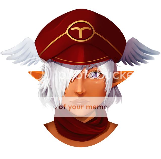
- by Sweet_Sakuraa |
- Painting And Drawing
- | Submitted on 03/25/2009 |
- Skip
- Title: picture
- Artist: Sweet_Sakuraa
- Description:
- Date: 03/25/2009
- Tags: picture
- Report Post
Comments (4 Comments)
- greenkazoo123 - 09/07/2009
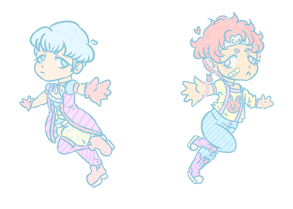
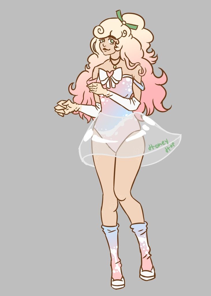
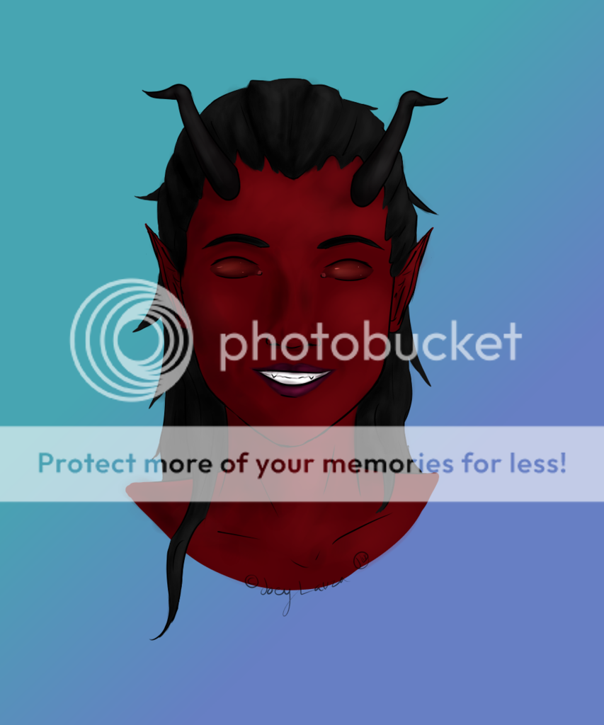
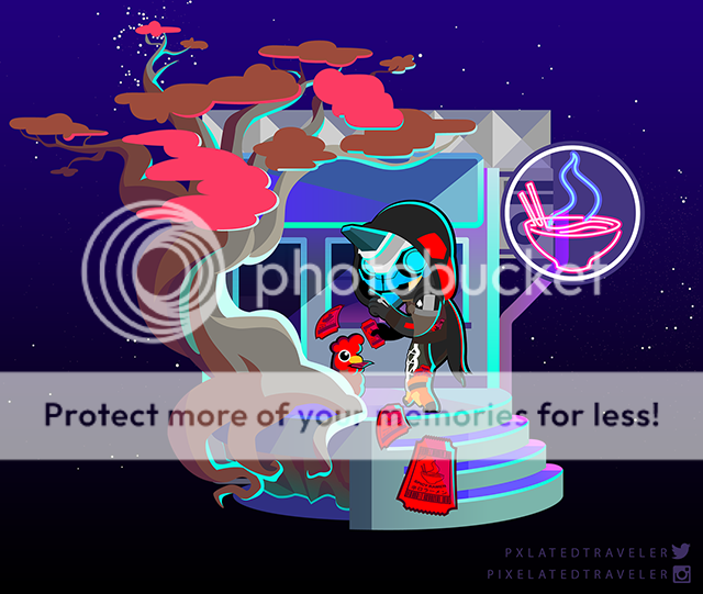
- its great! the only thing thats not great, is the eyes, too far apart. Other than that, its great! and really great job on the hands.
- Report As Spam
- Phantom-of_Winter - 03/28/2009
-
A bit blurry, the outlines are a bit scratchy and their is no signs of any shading elements in this piece. And the eyes look disproportioned... but the body proportion itself is good.
Keep praticing...
2/5 - Report As Spam
- Xx_Devilish_Trouble_xX - 03/26/2009
- A bit smudgy. cler it up. the dress, face, body,and evryhting else is perfect.great on the hands! not many people cand o hands good. 4/5
- Report As Spam
- wmiinkdeys - 03/26/2009
- Well done. I like the simple colors and lines and the facial expression is well done. What you could work on is eliminate the smudge marks that blur the black lines. It takes away from the image. You are doing a great job. Keep it up
- Report As Spam


