- by devilgirl49 |
- Painting And Drawing
- | Submitted on 03/29/2009 |
- Skip
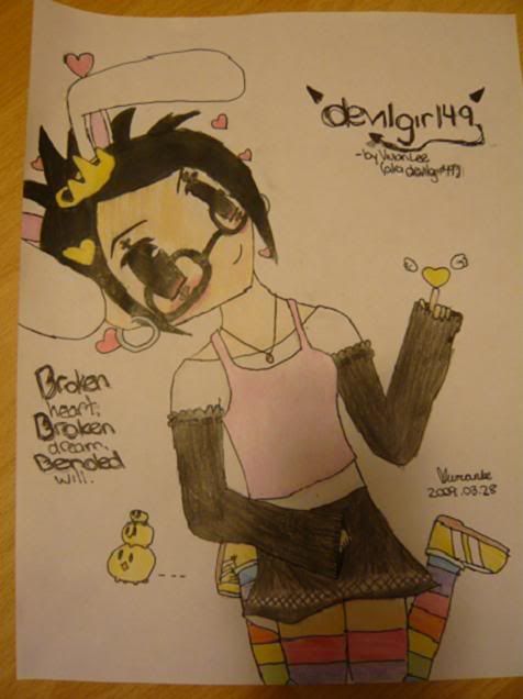
- Title: Easter -devilgirl49
- Artist: devilgirl49
-
Description:
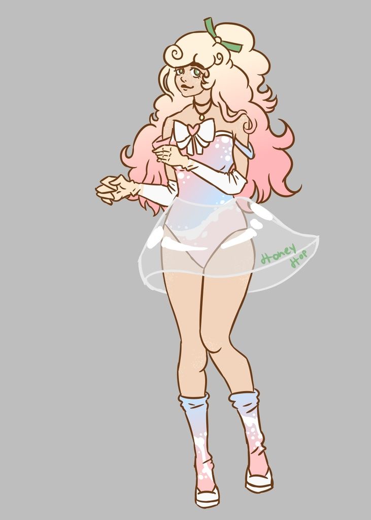
I JUST FINISHED THIS!
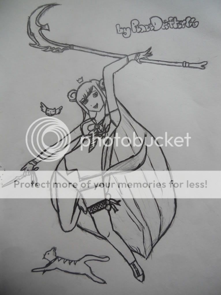
Anyways this is my first time EVER inking and colouring something. I used a black gel pen and normal pencil crayons XD Overall I like how it came out, and I ignored my perfectionist side =)
Comments+criticism loved. Tell me how to improve, what parts are bad. *Already know the right foot is @#$� up. - Date: 03/29/2009
- Tags: easter devilgirl49
- Report Post
- Reference Image:
-

Comments (7 Comments)
- Team Basic - 08/19/2009
- um...the neck looks like its off to the right more than it should be....
- Report As Spam
- Honoka-Kiyoshi - 04/06/2009
- hands are a bit small. the proportions seem off and thats not a natural pose for the legs.........
- Report As Spam
- aniral - 04/04/2009
- Hands, again, are a bit small, but the overall concept is really good and shines through with potential. This is something that would be great to come back and redo when you're better. 4/5.
- Report As Spam
- I hate homework 0-o - 04/01/2009
- I likes the pose. Colors compliment each other. Nice!
- Report As Spam
- Askman_16 - 03/30/2009
- Good job. I can tell u put alot of work into it smile
- Report As Spam
- Celina Amara - 03/30/2009
-
awe its really cute ^-^
i say ignore the comments before me. it may not be the best i've ever seen but i can tell you put your heart into it and i really like it ^-^ - Report As Spam
- emeraldocean_von_siraine - 03/30/2009
- It's sorta okay... I'm guessing she's sitting, right? Maybe you should have made her shoulder lean on the border with her head. Then tilt the head less.
- Report As Spam


