Comments (7 Comments)
- shadownater - 11/28/2009
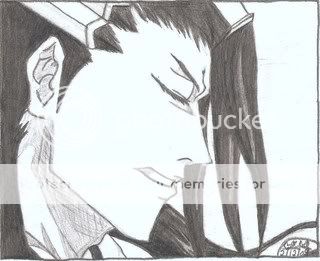
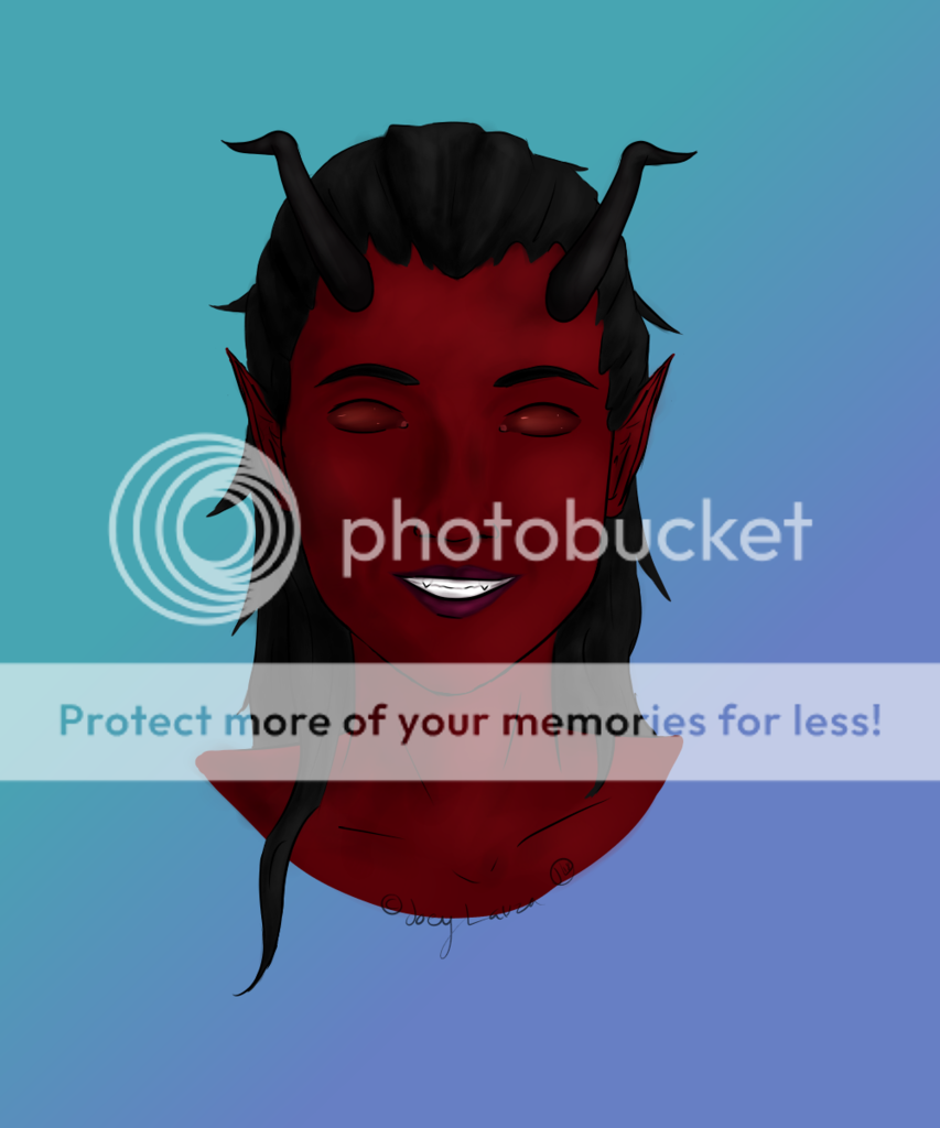
- Just wanting to say that I really like this picture and I really like his 'sigh' look in this face. c: I know this look from my own guy. xD I would tell you to add line dynamics so that the eye is more attracted to it. c: Like having thick and thin lines. c:
- Report As Spam
- BlackSnowDrop - 11/14/2009
- sorry for the caps lock XD my finger slipped XD
- Report As Spam
- BlackSnowDrop - 11/14/2009
- I LIKE IT, BUT THE BACK OF THE COMPUTER SEEMS BIGGER IN DIMENSION THAN THE REST OF THE COMPUTER XD
- Report As Spam
- anna62a - 05/04/2009
- the computer looks a little flat, but you really have the basics in both coloring and physical design (i guess that's the word to describe the anime being) done t a really confident level...
- Report As Spam
- madelonnetjuh - 05/04/2009
- Wow! How did you do that! So beautiful! (L)
- Report As Spam
- SoccerMama223 - 05/03/2009
- Not possible! It's amazing!
- Report As Spam
- Leux - 05/02/2009
- yes I did, on the photoshop CS4 and de outlines on illustrator wink
- Report As Spam


