- by Kenshin Kyo |
- Painting And Drawing
- | Submitted on 05/13/2009 |
- Skip
Comments (2 Comments)
- Angel Seraphiel - 07/12/2009
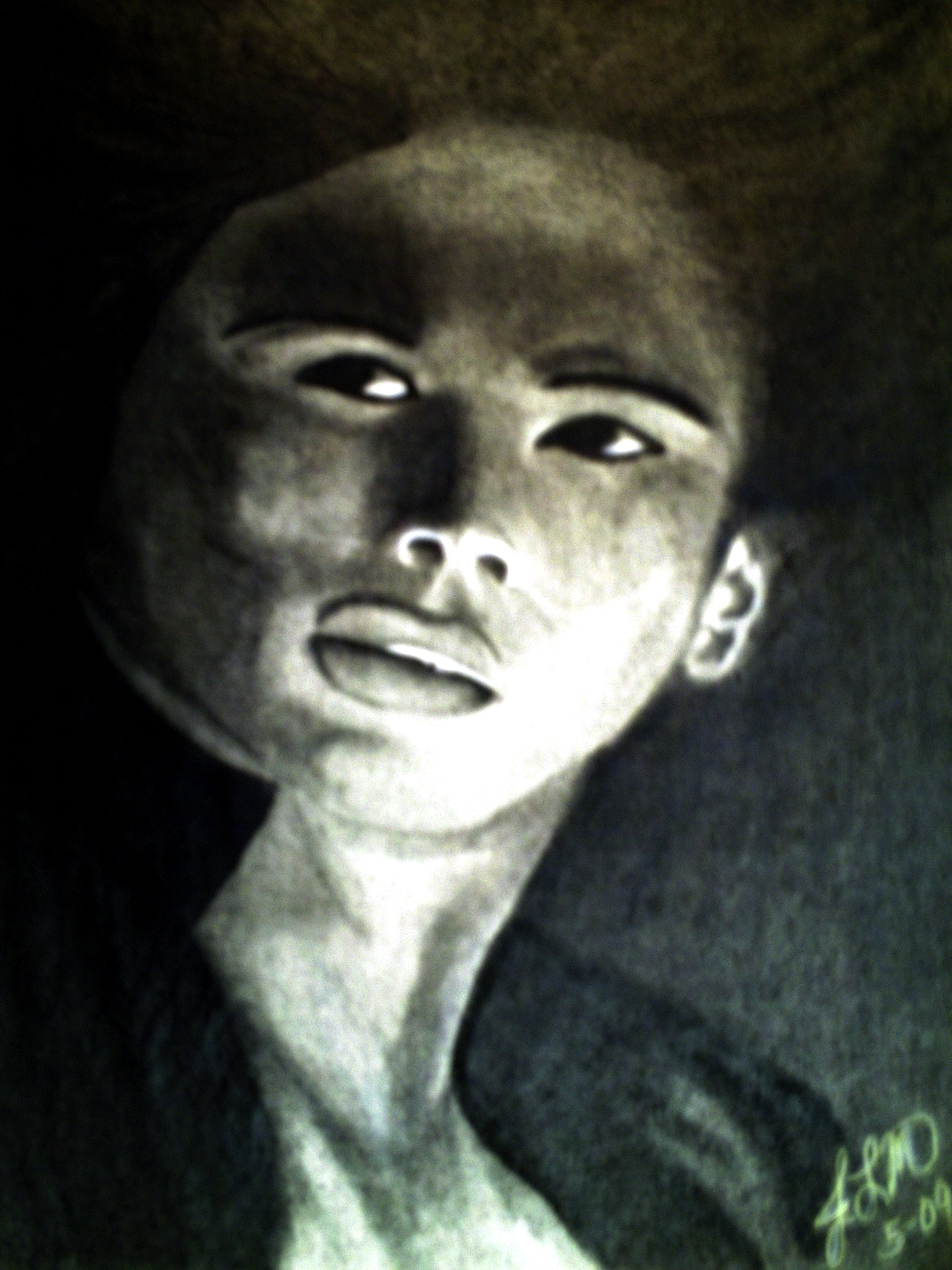
- It is still amazing, and I think the facce looks stretched because she didn't scan it but made a photo of it 5/5 <3
- Report As Spam
- Annedrea - 05/15/2009
- The face looks somewhat stretched. I understand that the shadows of the face can be kind of misleading. Just place a finger over the top left of the face and you'll see how much better it looks. The mouth can be aligned a little bit more under the dent of the mouth. It's somewhat asymmetrical. Of course the picture is not precise but It's totally realistic looking it only needs a few slight changes and all in all your pic is amazing your shading technique is just phenomenal! 5/5
- Report As Spam


