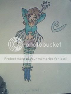
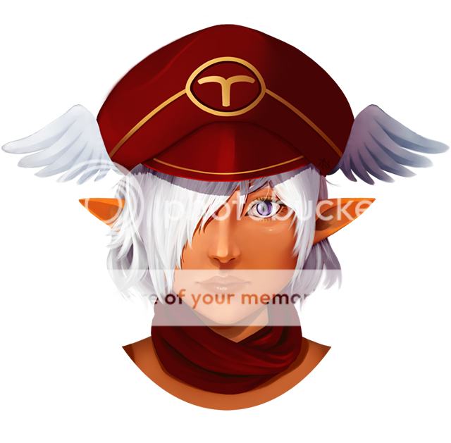
- Title: At The Cabaret - UNFINISHED
- Artist: Melodokii
-
Description:
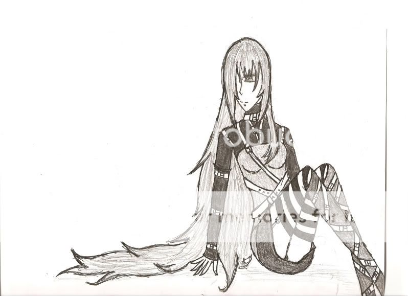
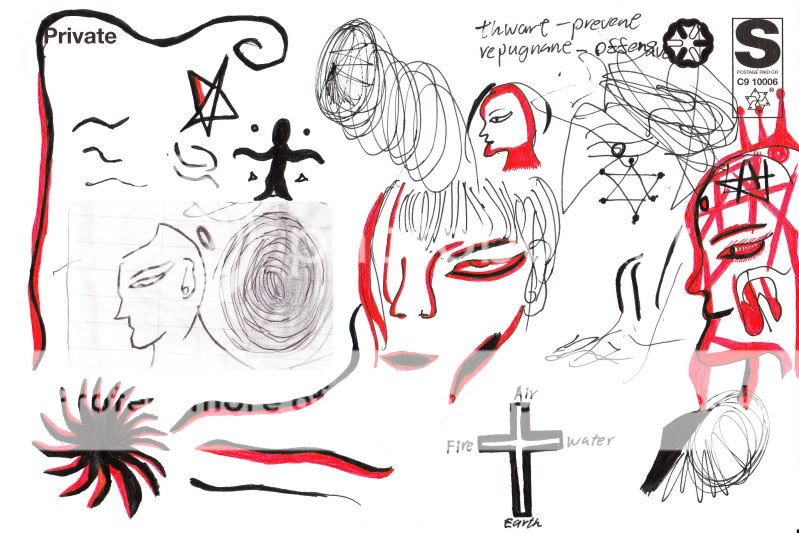
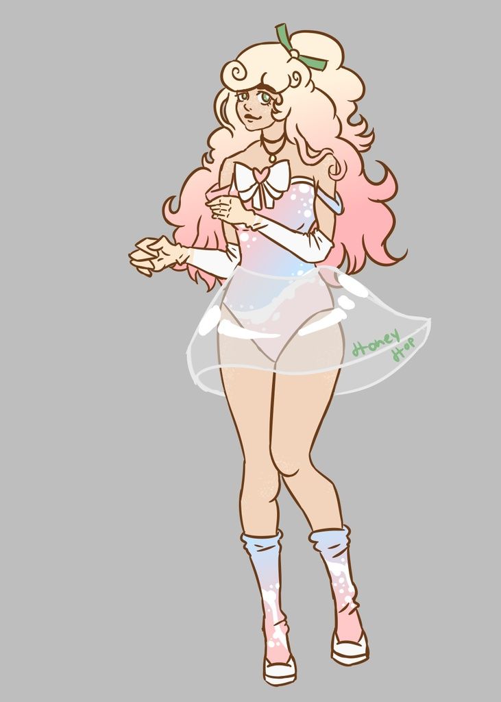
BAD SCAN ALERT. 'KAY her shoulders are funny and she looks like she's got her head on backwards and there's no background to speak of but i dont really care at this pointtttt CUZ ITS NOT FINISHED YAY BUT I DONT WANT TO WORK MORE ON IT RIGHT NAOW
:D
Ah well.
Cropped some of the ugly white space from above her head.
I'm not exactly expecting a 5/5 or anything on this one. - Date: 05/23/2009
- Tags: cabaret burlesque melodokii dokii
- Report Post
Comments (5 Comments)
- Parsleys Thyme - 10/14/2009
-
AWESOME!!!! I love it!
I know, that's happening with a lot of art recently. It's been happening with mine, and it's really annoying.
5/5 for you! You deserve it. Great job!!
Check out my work, please? - Report As Spam
- Melodokii - 05/26/2009
-
:S I don't get you. If you want to rate 1/5 why not make a reason, critique, explain what can be improved.
Don't just flame other people's works so that yours looks better. - Report As Spam
- emperor rene - 05/23/2009
- wow if this isn't the funkiest...(1/5)
- Report As Spam
- Melodokii - 05/23/2009
-
Thank you! biggrin
I know what you mean about the face, I'll try using a mirror for proportions when fixing it next time I work on this piece. Thank you for the tip on the shoulders, I will incorporate that too. smile
Thankyou again! x - Report As Spam
- Zeefruit - 05/23/2009
- This would have been a 5/5 if her face was more proportionate. Right now it's just too big for her head. Maybe next time you could look at your own head in a mirror while you sketch, in order to get more realistic, natural-looking proportions. The rest of the image looks great, though. (If she is supposed to be pushing her shoulders back, you could try sublty accentuating her shoulderblades.)
- Report As Spam


