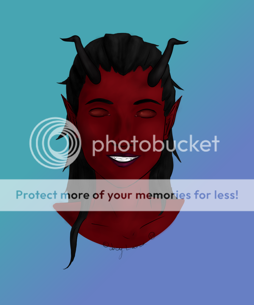
- by City of the Moon |
- Painting And Drawing
- | Submitted on 09/24/2009 |
- Skip
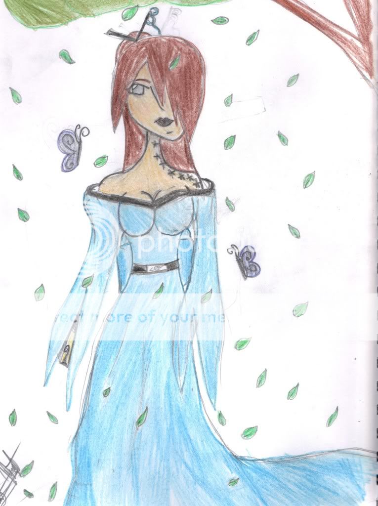
- Title: Advancing...
- Artist: City of the Moon
-
Description:
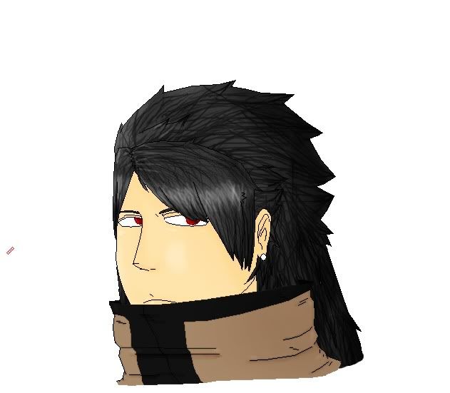
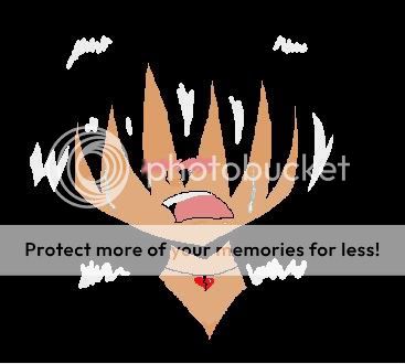
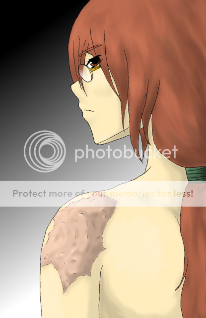
I'm progressing a bit, nothing incredible yet.
Now, I want some constructive criticism, if it's the hair's coloring, I just need a good mouse/hand technique, but as for everything else, I want constructive criticism, please? ;D - Date: 09/24/2009
- Tags: advancing
- Report Post
Comments (2 Comments)
- l La Reveuse l - 08/06/2010
- Your proportions are really off. The face doesn't have any shape. You should shade the lips a different color than his skin. His mouth is too far away from his nose and his face is too long. The wrinkles shouldn't just be lines, you need to add shading to those as well. The inside of his ear should be dark. Add shading to his hair, face, and clothes unless the light is shining directly on him and not from an angle. The eyes are too elongated. You should save up for a tablet and photoshop.
- Report As Spam
- ZxZchelsZxZ - 09/27/2009
-
nice drawing
- Report As Spam


