- by DaftGirlCC |
- Painting And Drawing
- | Submitted on 03/29/2010 |
- Skip
- Title: Lust (more detail)
- Artist: DaftGirlCC
-
Description:
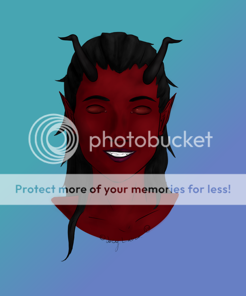
The same picture of Lust I started on yesterday, but with more done to it. The story is, this woman had an afair with the man you see in the background. They were both sent to hell for lust of one another.
Still mechanical pencil on paper, but with some Prismacolor colored pencils for the blood this time.
I'll be submitting my finial product in a few days.
The song that inspired the detailing was Awaken by Dethklok. (along, still, with The Inferno by Robert W. Smith) - Date: 03/29/2010
- Tags: lust more detail
- Report Post
Comments (7 Comments)
- DaftGirlCC - 09/23/2010
- Thanks. I understand. I have this picture in more detail even, now, but I just forgot to put it up. But I'm glad you undertsand and can give more professional advice.
- Report As Spam
- kiku_michi - 09/23/2010
- Oh is she on a table? If she is then it would be good to make the floor the guy is on darker, or gradate from black to a light shade of gray from the table to the man and put an edge on the table so it's less confusing. I like the shading and expression on the woman though I think it could use more blacks and highlights.
- Report As Spam
- kiku_michi - 09/23/2010
- Sorry it cut me off ._. So if you could do that and then also shade in the walls and blend it all out more evenly then it will look more complete and professional. Oh and darken the ground around the figures and blend it out so that there is more contrast that would be great.
- Report As Spam
- kiku_michi - 09/23/2010
- Ok, so bear with me since I do have a little criticism, but! I actually go to an art school so I'll actually know what I'm talking about. First of all, it's a great composition and the anatomy is fine. All I really have to say is that they look like they're floating, and that one line coming from the chain and then trailing off the page makes it look like she's hanging over a short wall. If you could add more shading to the ground and show the edges of all of the room so it has a full horizon..
- Report As Spam
- MaskedMaggot - 05/18/2010
- Thats amazing. I LOVE IT
- Report As Spam
- Kainaa - 04/04/2010
-
this pic is awesome! excitingly creepy lol
good job - Report As Spam
- AkatsukiYaoi517 - 04/02/2010
- Amazing, but soooo f***ing creepy, and I love it!!
- Report As Spam


