- by HometownHorrorStory |
- Painting And Drawing
- | Submitted on 12/28/2010 |
- Skip
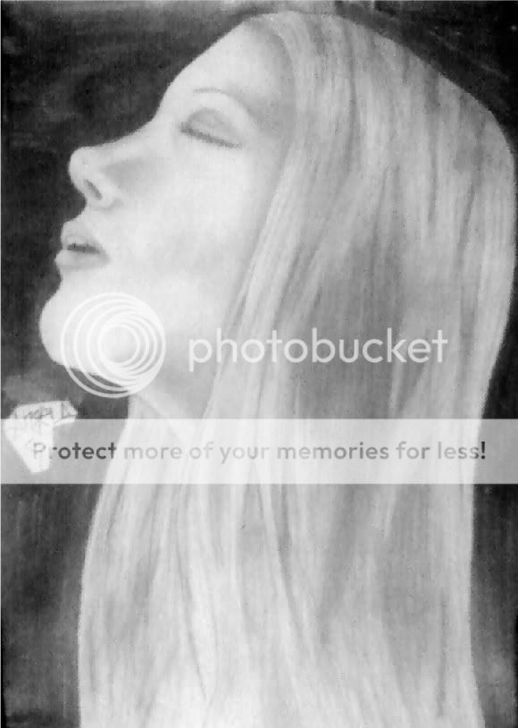
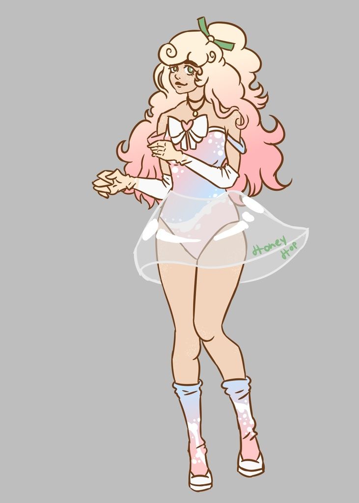
- Title: Ballerina
- Artist: HometownHorrorStory
- Description: Other than the crap pic and the lightness of my pencil...how do you like it?? Any tips?
- Date: 12/28/2010
- Tags: ballerina
- Report Post
Comments (1 Comments)
- SCRIG - 12/29/2010
-
It looks great--up to the head...
Tips~Try to point the chin and emphasize the jaw/cheek-bone according to what age the ballerina is. The mouth should have less lines, to look more shoujo. The nose should be smaller, and the eyes...well they look fine, I guess. Oh and the knees should be higher.
This shows potential, but keep practicing! 4/5 biggrin - Report As Spam


