- by chocolatecreamycookie |
- Painting And Drawing
- | Submitted on 11/22/2011 |
- Skip
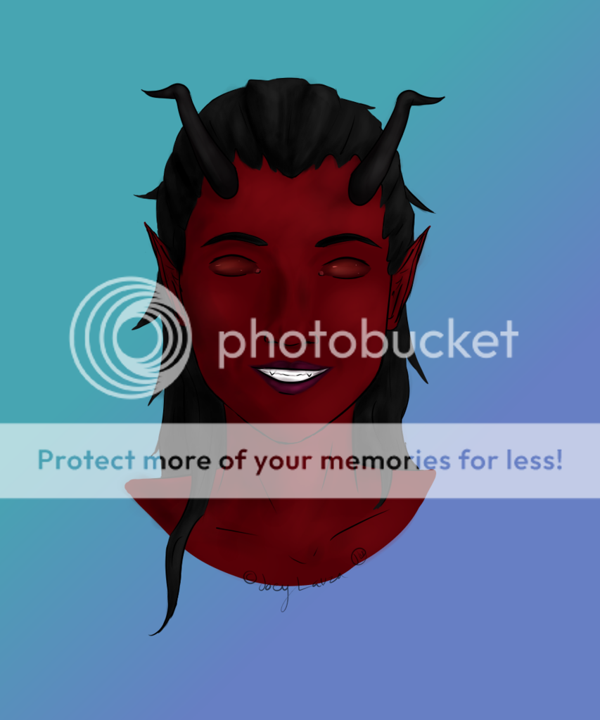
- Title: Matthew
- Artist: chocolatecreamycookie
-
Description:
had to expand my own photo from our photo shoot for art class and i chose this one
what do i need to work on and such things? - Date: 11/22/2011
- Tags: matthew people realistic
- Report Post
Comments (2 Comments)
- Victoria_2200 - 12/03/2011
-
well , this is unique , it looks realistic obviously , LOL and i think it looks fine , but i kinda agree on the shirt thing , other than that it looks great =D - Report As Spam
- Captain Confuzmint - 11/22/2011
- I really like it, but the shirt looks odd. The arms have dimension, as does the neck and face, but the shirt looks 2D. Try making some texture to it, like you did the rest. Wrinkles, shadowing. 4/5
- Report As Spam


