- by iiPandyBeardesu |
- Painting And Drawing
- | Submitted on 05/01/2012 |
- Skip
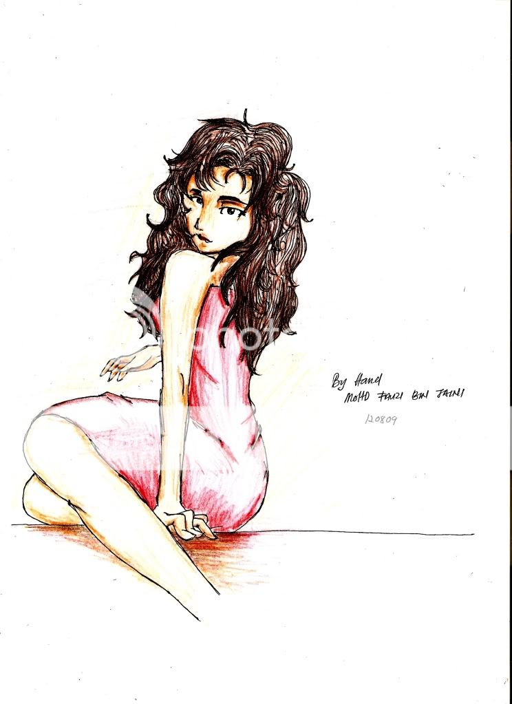
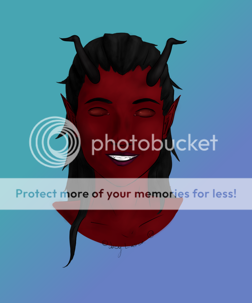
- Title: Girl with weapon vs. 2
- Artist: iiPandyBeardesu
- Description: I fixed it :3
- Date: 05/01/2012
- Tags: girl with weapon
- Report Post
Comments (2 Comments)
- Kia Sai - 05/29/2012
-
Way too much.
Clear up your lines and keep everything from blending together so much...
The background looks like its part of the picture instead of adding on to it. Way too much going on in the background to focus on the main picture.
1/5 - Report As Spam
- Doc_Brown - 05/11/2012
- I still have some issues with the blurriness and kluttered look to the picture. The weapon gets lost in the background swirliness and the eyes are not very defined. Maybe some crisp lines will help her look more present.
- Report As Spam


