- by PsychedelicDreams |
- Photography
- | Submitted on 07/01/2009 |
- Skip
- Title: Addicted
- Artist: PsychedelicDreams
-
Description:
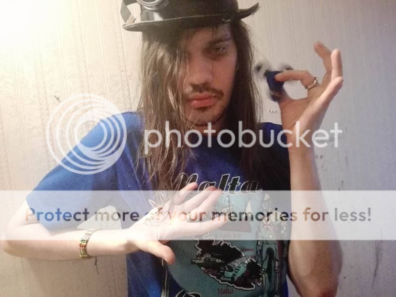
From a recent photo project.
WORK IN PROGRESS
PLEASEPLEASE leave a comment, I really need critiques. Tell me about color, composition, lighting, the whole bit. Please tell all.
I really need you guys to talk to me, I'm in the process of learning what makes a good photo.
Plus, you get GOLD for commenting! - Date: 07/01/2009
- Tags: addicted drugs heroin photoshop
- Report Post
Comments (6 Comments)
- Uncool Ghoul - 07/02/2009
- i dont know why but i think there should be a tiny bit of blood markings to the right on her head, on the wall. also, kinda too much red under the eyes, but not too bad
- Report As Spam
- Waiana - 07/01/2009
- There is a little too much read around the eyes and needle. The lighting is great, and so is the color. Overall, great job!
- Report As Spam
- Ice-NinjaxXx - 07/01/2009
- a little less red around the needle and the eyes.. otherwise you really captured the image
- Report As Spam
- sabrehockey8 - 07/01/2009
- good coloring
- Report As Spam
- 0rockoutloud0 - 07/01/2009
- a little less red around the needle or you might want it to fade away faster the cuts and track marks are wonderful. and i think the red under the left eye(looking at it) is in to much of a 'swooping' motion and a little to far down on the face. Over all a very nice apperance i like the smoke effect around her
- Report As Spam
- ThePossessedPuppet - 07/01/2009
- ...perhaps some hair over the eyes, a ruffled look...
- Report As Spam


