- by thecatsred |
- Photography
- | Submitted on 07/16/2008 |
- Skip
Comments (6 Comments)
- animalia02 - 02/21/2009
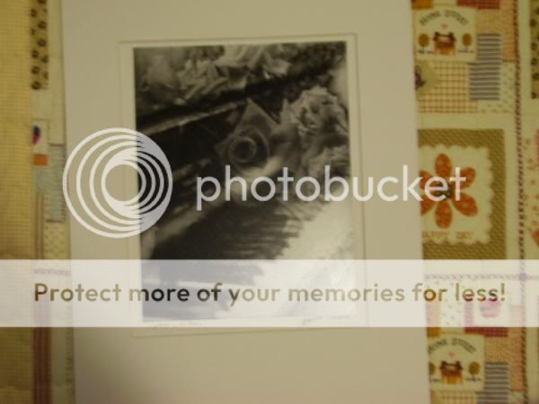
- It's really good, but I think that maybe its just too focused on the cupboard or whatever it is...
- Report As Spam
- Jigotiga - 07/22/2008
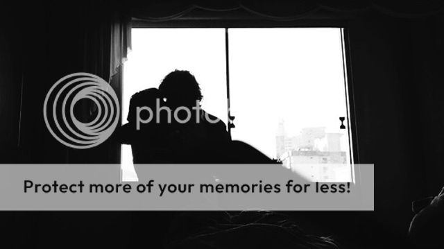
- I really like this picture. I just don't like it that the foreground takes up so much of the photo. Still good though! I like.
- Report As Spam
- joanaraine - 07/16/2008
- smile
- Report As Spam
- Phoenixliv - 07/16/2008
- I wish there was more dynamic range so I could see inside to the inner workings a little more.
- Report As Spam
- Borogarl - 07/16/2008
- Awesome! You've really hit the "light vs. shadow" play! Looks great.
- Report As Spam
- Kail Ritsuka - 07/16/2008
- =o
- Report As Spam


